
Ideal Barcode Colours for Seamless Scanning
Selecting the proper hues for your barcodes can considerably enhance the effectiveness and precision of scanning. Ideal barcode colours help scanners to swiftly and accurately read barcodes, minimising errors and accelerating the process. This article delves into why selecting optimal barcode colours is vital and the elements you need to consider for smooth scanning.
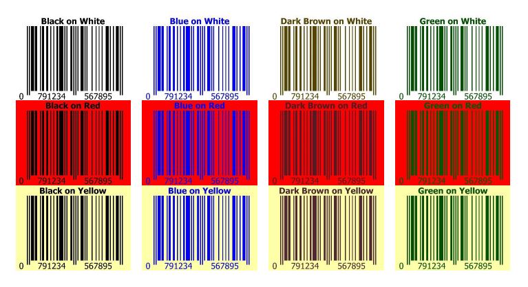
The image above illustrates acceptable barcode colour combinations that can be effortlessly scanned and decoded by barcode scanners.
Significance of Selecting Ideal Barcode Colours
Opting for the right barcode colours is crucial for making them easily recognisable against their background, ensuring quick and precise scanning. Typically, ideal barcode colours involve high-contrast combinations, such as black on white or vice versa, which facilitate the scanning process. Using colours that lack sufficient contrast may lead to scanning issues, as the scanner could struggle to differentiate the barcode from its background. Furthermore, optimal barcode colours are essential for legibility in various lighting conditions. For instance, if barcodes are scanned in dim lighting, high-contrast colours improve scanning precision. Conversely, very bright or reflective colours can cause glare, complicating the scanning process.
Is a Coloured Background Feasible for My Barcode?
Yes, you can print your barcode with a coloured background, provided you use a light shade to ensure high contrast between the black bars and the background. Avoid using black backgrounds since scanners cannot identify the white 'quiet zones' on either side of the barcode.
The best practice is black bars on a white background, but other combinations can work as well. However, not every colour is suitable. Consider these guidelines:
White and warm colours (yellow and red) are invisible to barcode scanners, making them ideal for the barcode background.
Black and cold colours (blue, purple, green, and dark brown) are visible to barcode scanners, making them suitable for the vertical barcode bars.
Contrast is key. The vertical bars should be darker than the background to ensure readability. It's advisable to test your printed barcode with different scanners, as they may have slightly varying colour calibration.
By selecting high-contrast colour combinations, considering lighting conditions, and accounting for the scanner technology used, you can ensure your barcodes are easy to read and scan efficiently.
For more details on barcode colours (as well as barcode dimensions and placement), please visit Barcodes India at https://indiabarcodes.com/.